It’s that time again, that time when we’ve made Stock Rover better and included a whole bunch of new features in version 3.0. As always, the changes we’ve made are largely based on suggestions from you, our users, as well as on our own long-term vision of the product. Note that some of these features will eventually be available only to paid subscribers once we switch to that model in the fall, and I’ll point those out. But for now, enjoy them freely!
Contents
- Portfolio Subfolders [1]
- Portfolio Allocation [2]
- Unlimited Screener Results [3]
- 10 Years of Data [4]
- Chart 100 Fundamental Metrics, and Several at Once [5]
- Even More Metrics! [6]
- Money Market Funds [7]
- Chart Max Drawdown [8]
- Screener Tooltips [9]
- Apply Ranked Screeners to Watchlists [10]
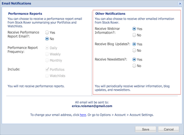
- Control the Type of Emails Your Receive [11]
- Some Extras and Bug Fixes [12]
Portfolio Subfolders
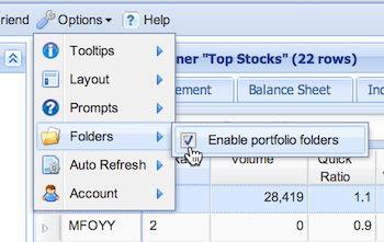
You can now organize your portfolios into subfolders. Here’s how it works: first, go to Options → Folders and check the box for Enable portfolio folders.
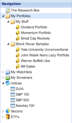
This will place all your portfolios in the Default subfolder From there, right-click either “My Portfolios” or the Default subfolder, select “Create Folder” from the drop-down menu, and then give the new folder a name. Then you can drag your portfolios into the different folders; you can also drag and drop the subfolders to rearrange their order. You can also rename the Default subfolder to whatever you like.
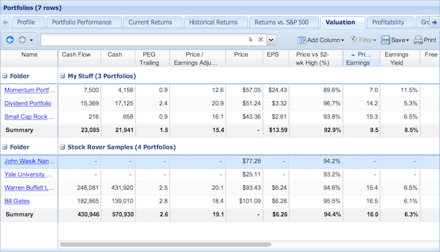
Now, when you click on “My Portfolios”, not only will your portfolios be listed in the Table, but you’ll also be able to see their performance grouped by the subfolders, like so:
If you want to temporarily disable the folders feature, just go back to the options menu and uncheck the box. Don’t worry, this will not get rid of your folder organization! Next time you enable folders, your portfolios will be organized just as you left them. Think of the enable/disable portfolio folders as simply a view option that you can easily control from the Options menu.
Portfolio Allocation
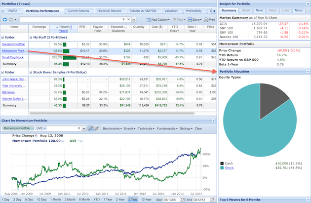
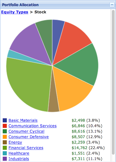
You can now see the breakdown of equity allocation for all of your portfolios in a visual format. To see the allocation pie chart, you’ll need to have a portfolio displayed in the Insight Panel. To do that, first click ldquo;My Portfolios” in the Navigation panel so that all your portfolios are listed in the Table. Then select the row of the portfolio you want to see in the Insight Panel (just select the row, don’t click the hyperlinked name) and you’ll see that the Summary tab in the Insight panel now has a Portfolio Allocation section, which has a few layers of allocation information analysis.
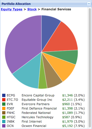
First, you’ll see the breakdown of equity type for the portfolio (shown above). But you can click down further to see the breakdown of your holdings within that equity type. So, for example, if you click “Stock” then you’ll see the sector breakdown of your holdings.
You can keep following the links down into the allocation of industries of your portfolio, then the stocks within those industries. The breadcrumb trail can help lead you back up to the larger categories.
Unlimited Screener Results
The screener no longer limits the number of returned stocks to 250, so you can now page through thousands of tickers. So go! Screen! Then page to your heart’s content.
10 Years of Data
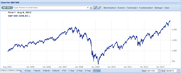
The chart now goes back 10 years, for both pricing data and fundamental data. So now we can more clearly see the full horror of the great recession.
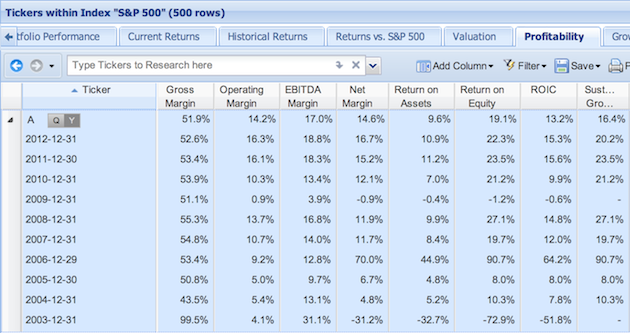
You’ll also see ten years of data if you expand a ticker in the Table (below), and in the Detail tab of the Insight panel.
This is one of those features that will be only available to paid subscribers in the future, but for now you’re free to dig into the early ’00s as deep as you’d like.
Chart 100 Fundamental Metrics, and Several at Once
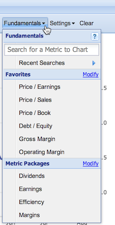
If you click the Fundamentals menu in the Chart, you’ll notice that the Chart just got a whole lot fancier. Now, not only can you chart over 100 metrics and keep a quick list of your favorites, you can also chart several fundamentals at once by bundling them together into a metric package!
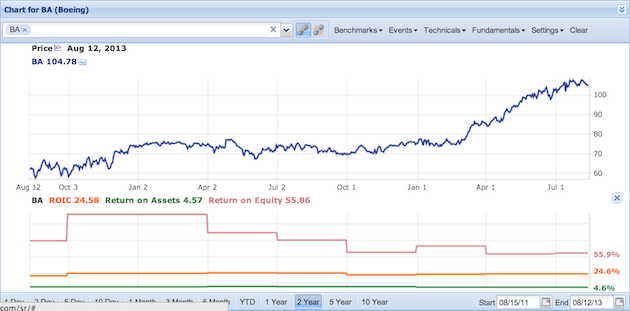
So, say you want to see several of the capital efficiency metrics charted at once. Well then, simply select the Efficiency package and voila! Return on Invested Capital, Return on Assets and Return on Equity appear together below the main chart. Note that while selecting a single fundamental to chart will have it chart for all tickers, metric packages will only chart for the primary ticker (the leftmost ticker in the research box.)
You can modify your favorites list and your metric packages by clicking the Modify links in the drop-down menu.
Even More Metrics!
We’ve added some more metrics to our database, here’s the complete list:
- 5-Year Price / Earnings Range
- 5-Year Price / Sales Range
- 5-Year Price / Book Range
- 5-Year Price / Cash Flow Range
- 5-Year Price / Free Cash Flow Range
- 5-Year Price / Tangible Book Range
- 5-Year Price Range
- Operating Income Per Share
- Yield On Cost
As always, you can add any of these metrics to the Table through the “Add Column” button in the Table’s toolbar. We have created a new view called “Historical Valuation” that will demonstrate many of these new metrics. For existing users, the new view was added automatically to your view set.
Money Market Funds
We also support over 1000 Market Funds, which means you can view their data in the Table, as well as add them to portfolios.
Chart Max Drawdown
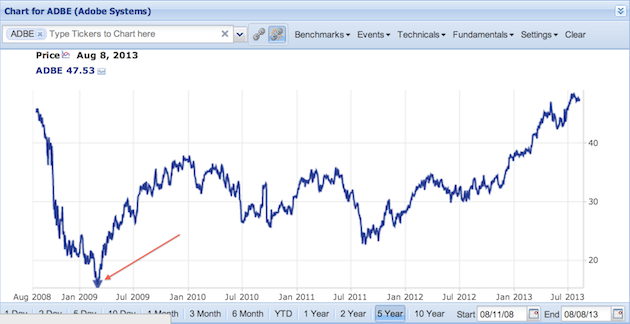
Under the “Events” menu in the Chart you can add the Max Drawdown to the chart. This will draw a down-facing arrow where the charted item had its biggest peak-to-trough decline during the charted period. If you mouse over the arrow, a tooltip will show the magnitude and the date of the maximum drawdown. You can see it down there nestled right in the crux between abject despair and buoyant optimism.
Screener Tooltips
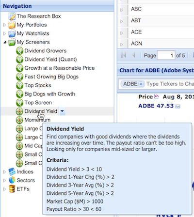
Forget exactly what your Dividend Yield screener criteria were? You no longer have to go through to the Task Wizard or the Screener Manager in order to refresh your memory. Now, if you check the box to show screener tooltips in the Options→Tooltips menu, you can just mouseover the screener in the Navigation panel to get a pop-up tooltip showing the screener’s criteria.
Apply Ranked Screeners to Watchlists
You can now rank your Watchlists according to your ranked screener criteria (previously, you could only rank a portfolio.) This works almost identically to ranking portfolios, so head on over to the help pages [25] to see how it’s done.
Control the Type of Emails Your Receive
You can now select what type of emails you want to receive from Stock Rover directly from your account. Just go to Options → Account → Email Notifications and you’ll be presented with a dialog window where not only can you elect to receive performance reports, but also choose what sort of Stock Rover emails you want to receive. The default is that you are signed up for all Stock Rover emails, but you can unsubscribe from our newsletters and/or emails about our webinars and blog posts.
Some Extras and Bug Fixes
Here are a couple of odds and ends as well:
- Benzinga has been added as a newsfeed ticker in the News tab in the Insight Panel
- If you export a screener, a readable version of the screener’s criteria will be listed at the end of the txt file.
- Screeners won’t hide Canadian dual-listed stocks. (Previously, if a stock was listed on a Canadian exchange but was dual-listed on an American exchange, it wouldn’t be shown in the results if you screened for Canadian stocks, but now we’ve fixed that.)
- The chart won’t occasionally switch up the colors on you
- Portfolio imports handle error cases better
And that’s pretty much sums up the changes in our new release! We hope you’re as excited about this version as we are. As always, we’d love to hear from you, so send any questions, comments, or suggestions to feedback@stockrover.com [27]. Happy researching!
