We believe that being able to directly compare stocks and ETFs in many different ways is critical for making smart decisions. Yet before Stock Rover, there were no affordable, integrated programs that allowed investors to do deep, side-by-side stock and ETF evaluation. Stock Rover has broken away from the pack by offering dynamic and easy-to-use tools for direct stock, ETF and portfolio comparison.
The Table
At the heart of Stock Rover is the Table. Don’t let the humble name of this feature fool you—it’s powerful. The Table has the familiar feel and function of an offline spreadsheet program, including the ability to sort, filter, color rows, and even add comments. On top of that, it pulls up-to-date financials and pricing data, and lets you dynamically swap out datasets at the click of a mouse.
Add tickers one-by-one, or by loading datasets such as your portfolios or the DJIA. You can then compare these rows across hundreds of financial columns, which are organized into “views” such as Growth, Valuation, Momentum, Dividends, and Historical Returns. Create new views using any columns you like, or update existing views by adding, removing, or reordering columns.

An example of tickers being compared in the Table
Quotes Box
Not only can you get quotes on thousands of tickers using our Quotes Box, but you can also create a watchlist on the fly, or compare individual quotes against any pre-existing dataset of tickers. This means you can easily explore how a ticker performs side-by-side against stocks in a portfolio or watchlist without altering that population. You’ll wonder how you ever managed without this feature!
Chart
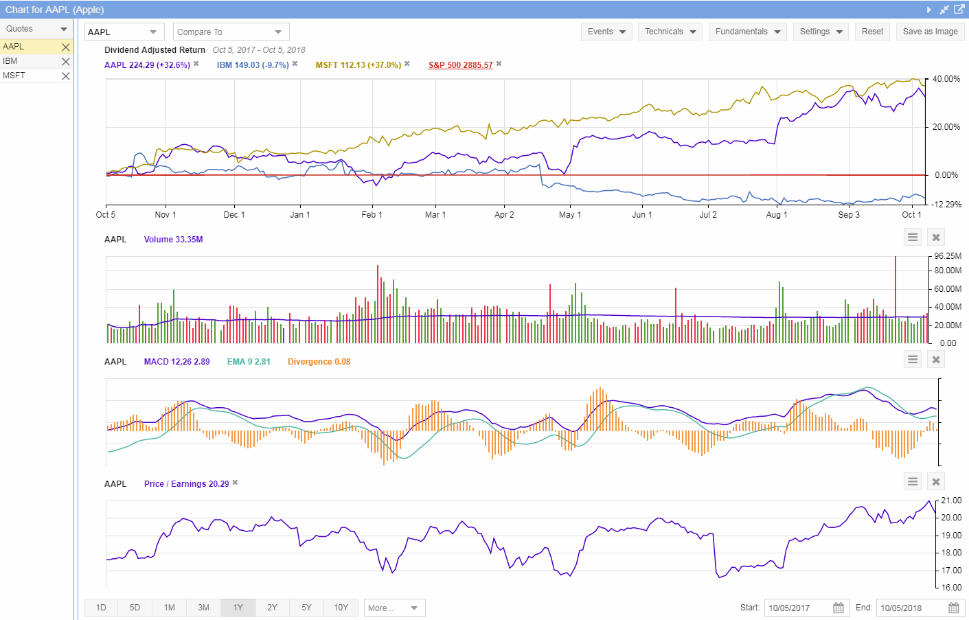
Compare performance over time with Stock Rover’s fast and easy-to-use Chart. In addition to the standard charting features you would expect from any program, we make it easy to scroll through the charts of any stocks in a portfolio or watchlist, and to add in benchmarks like a sector or the S&P 500. Plus with just one click you can set any line at zero (a baseline) in order to see relative performance in the clearest possible terms. The Chart comes with a number of built in technicals, can track events such as EPS announcements, splits, dividends, portfolio activity and alerts. It can also show you maximum drawdown points, can chart hundreds of fundamentals such as P/E, P/B and operating margin. The chart can display price, percentage, logarithmic or candlestick charts.

The chart for Apple. IBM and Microsoft added for comparison. The S&P 500 is set as a baseline.
Peers
In addition to the main Table, we also offer a table of industry peers for any given stock. Here you can add any columns of data you like, plus sort and filter in order to get the list down to the most relevant peer comparisons. With Peers, you can ensure that your pick is measuring up to its competitors, and you can easily find the top industry performers in any metric.
Portfolios
Stocks aren’t the only thing you can evaluate in Stock Rover. Line up whole portfolios side-by-side to see how they perform and compare to each other. For extended portfolio comparison, open the Portfolio Analysis window, where you can see how portfolios stack up in IRR, dividends, risk-adjusted return, and other detailed performance metrics.

Portfolios compared in risk metrics in the Portfolio Analysis table
For a practical application of these comparison tools, check out Stock Rover’s blog where we regularly compare and evaluate stocks.